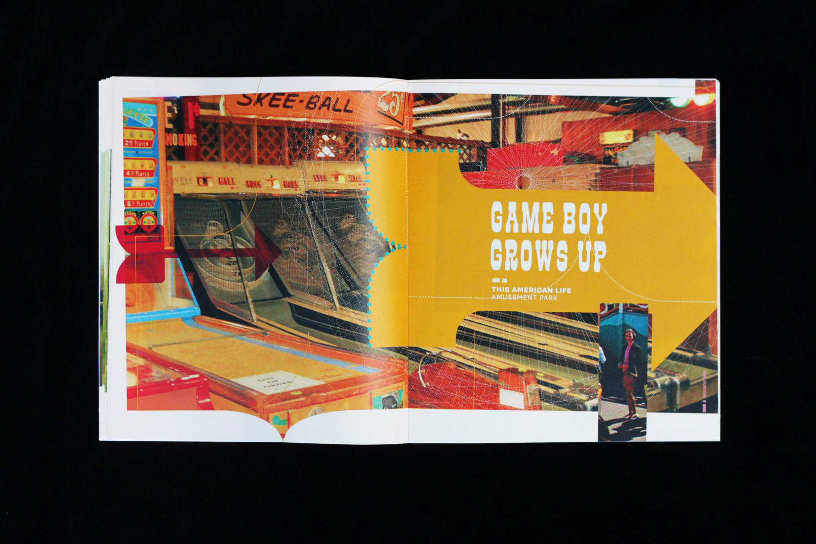
Translated episode #344 of This American Life into a print publication.
-
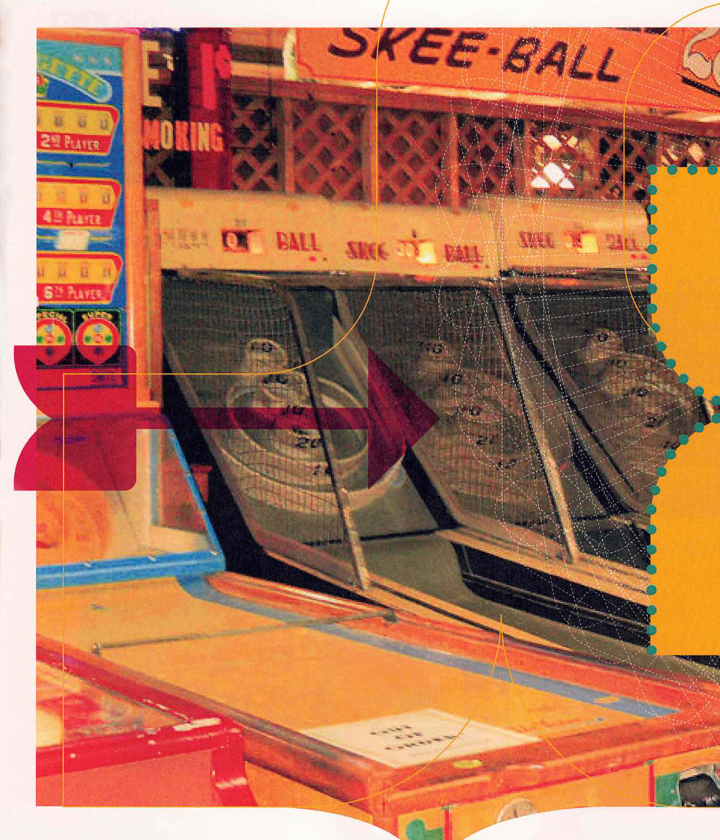
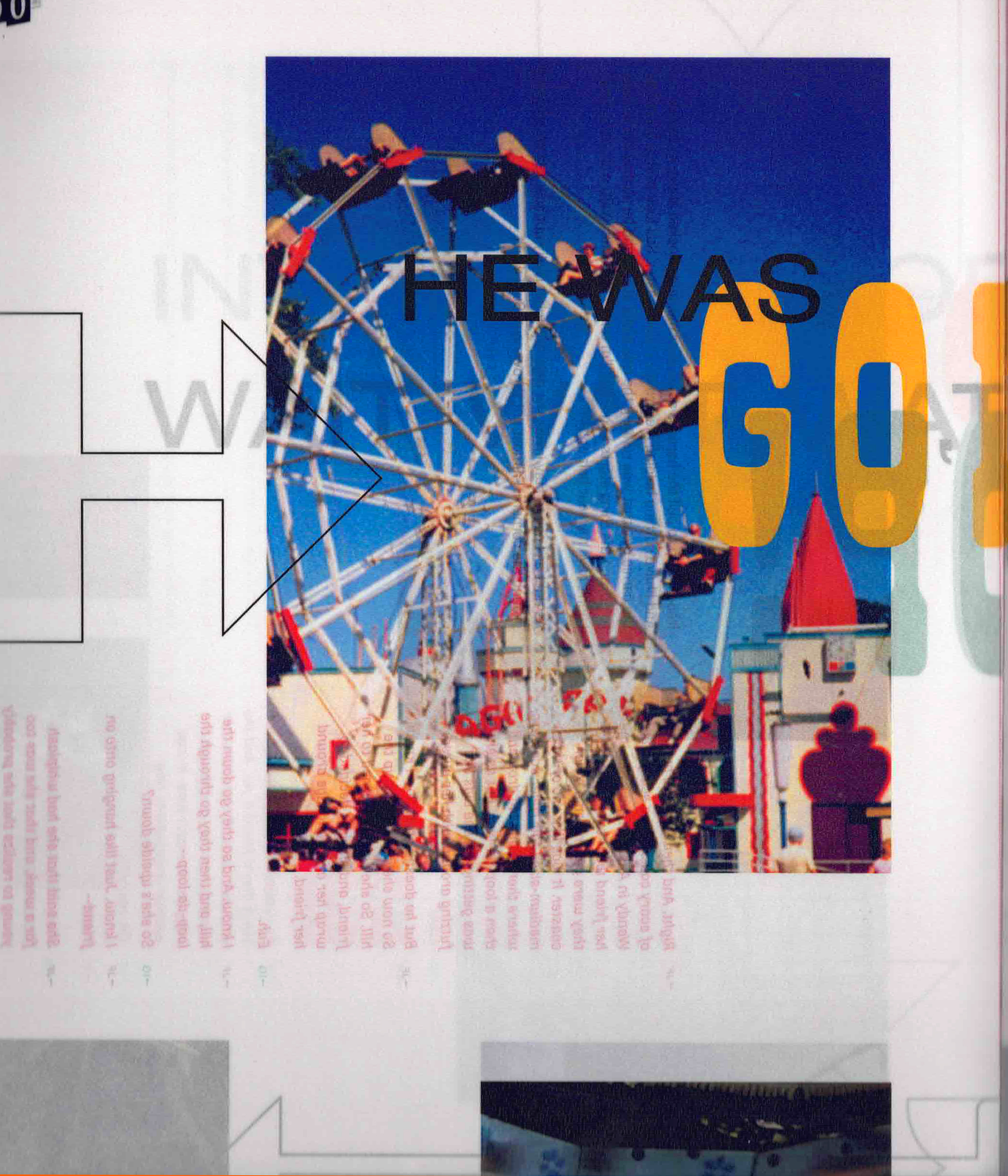
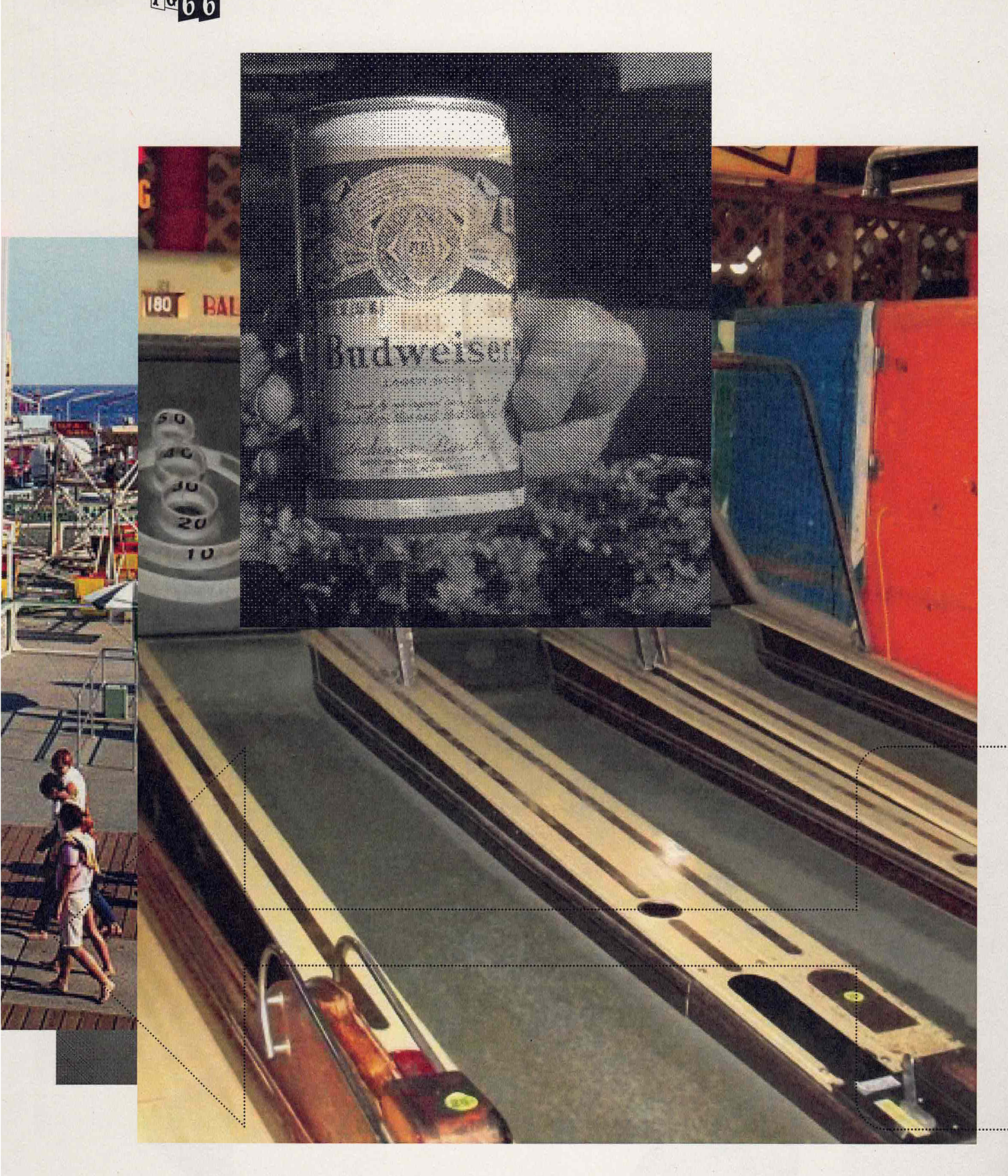
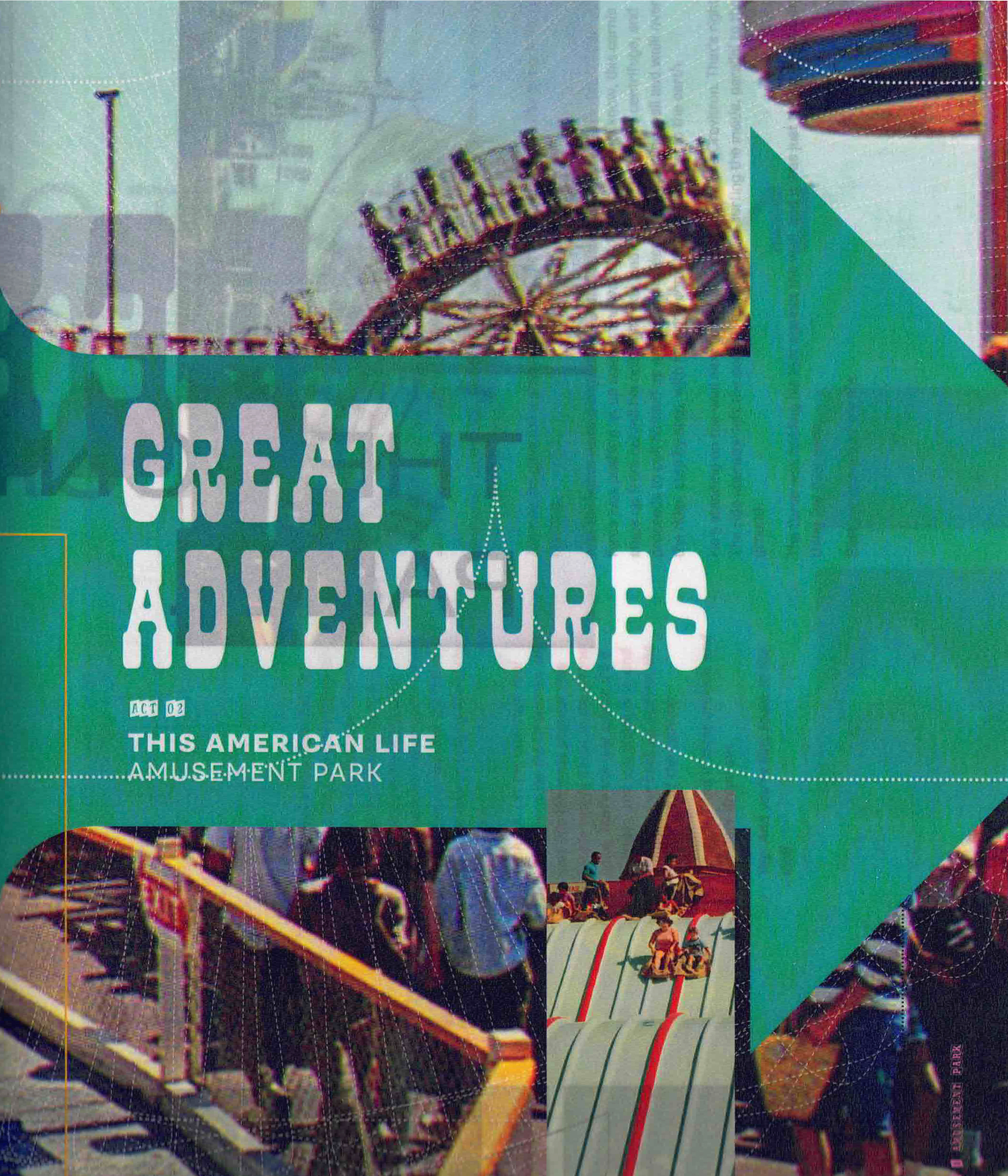
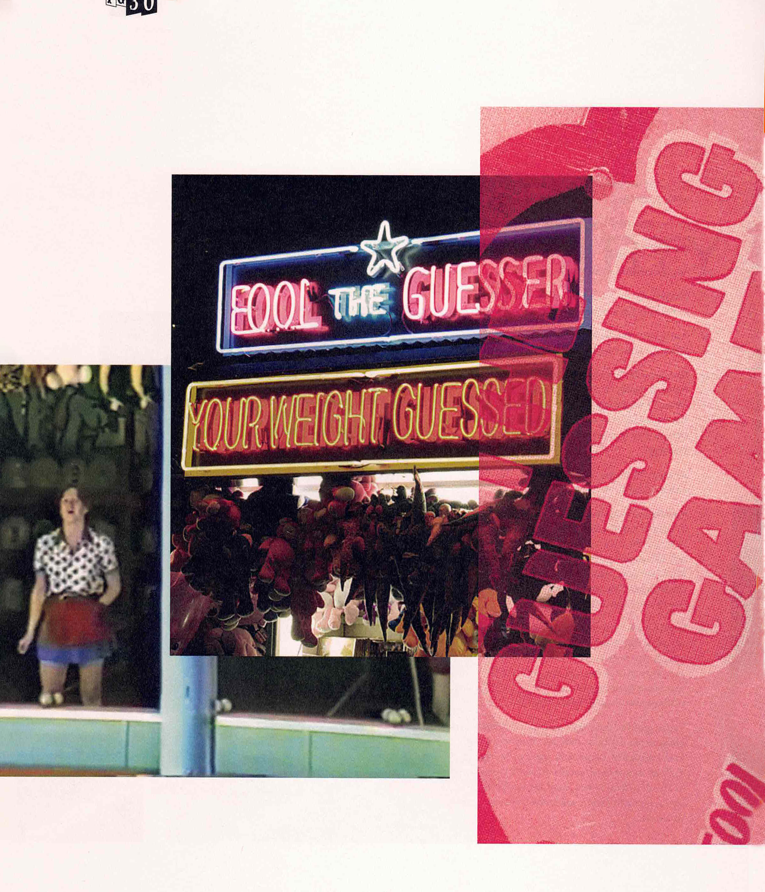
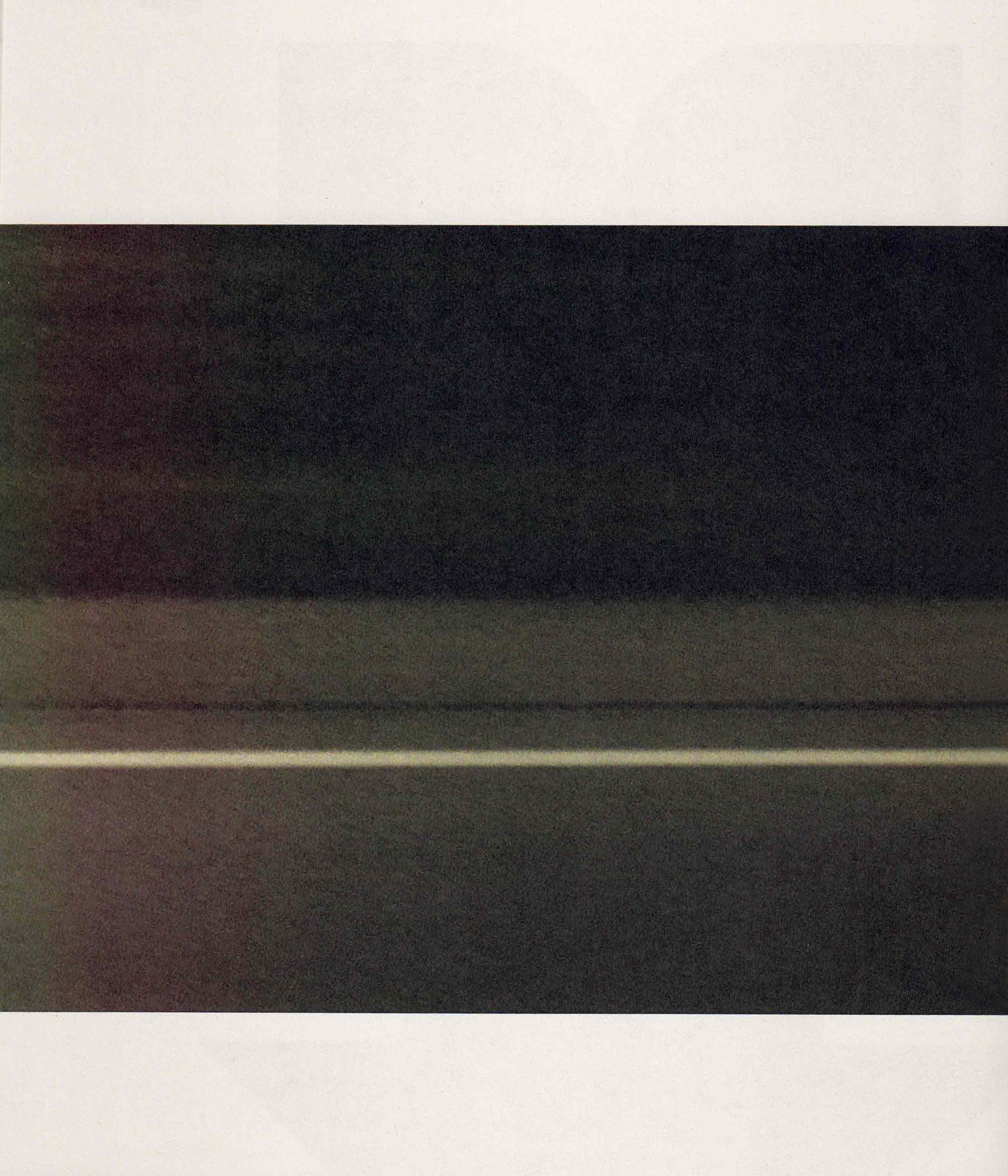
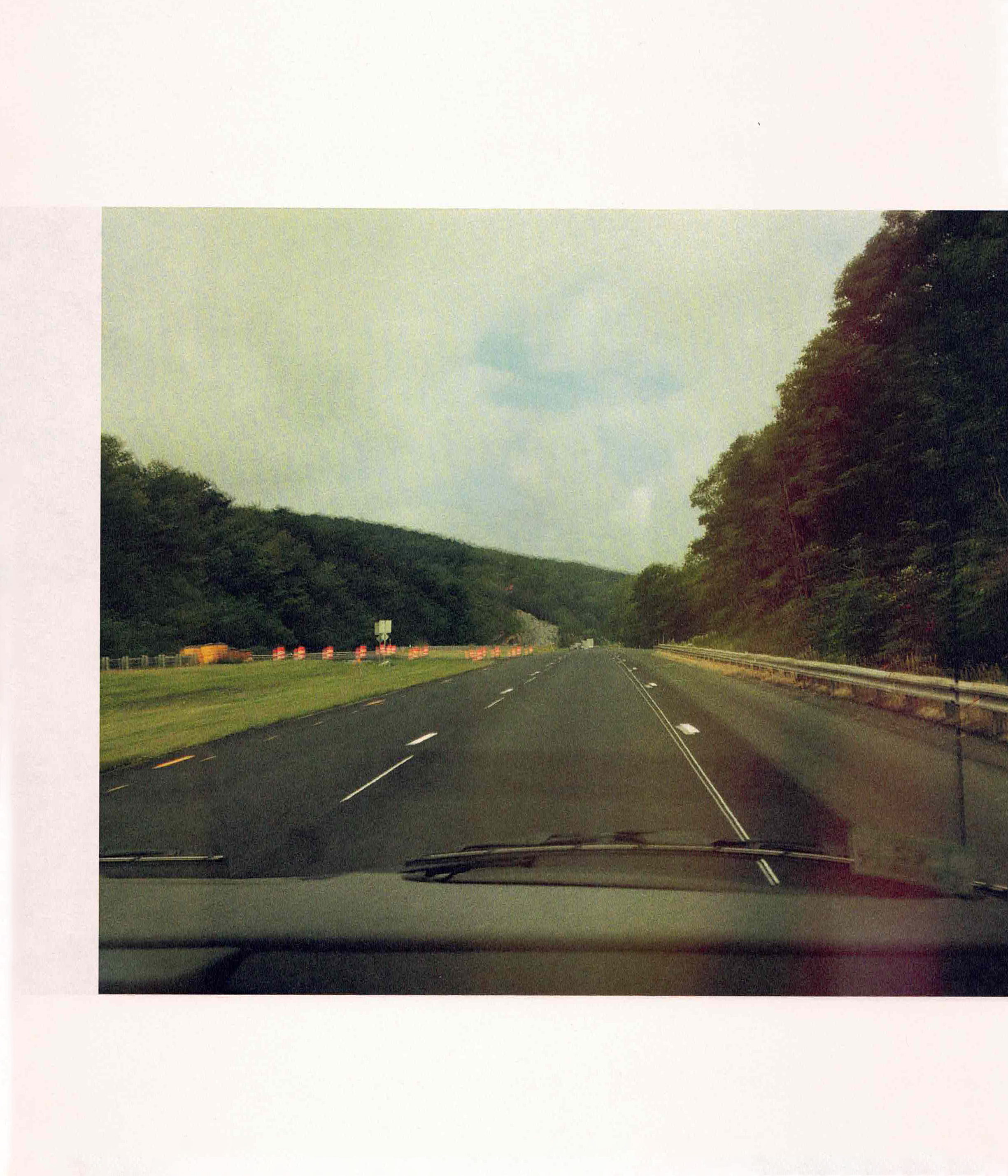
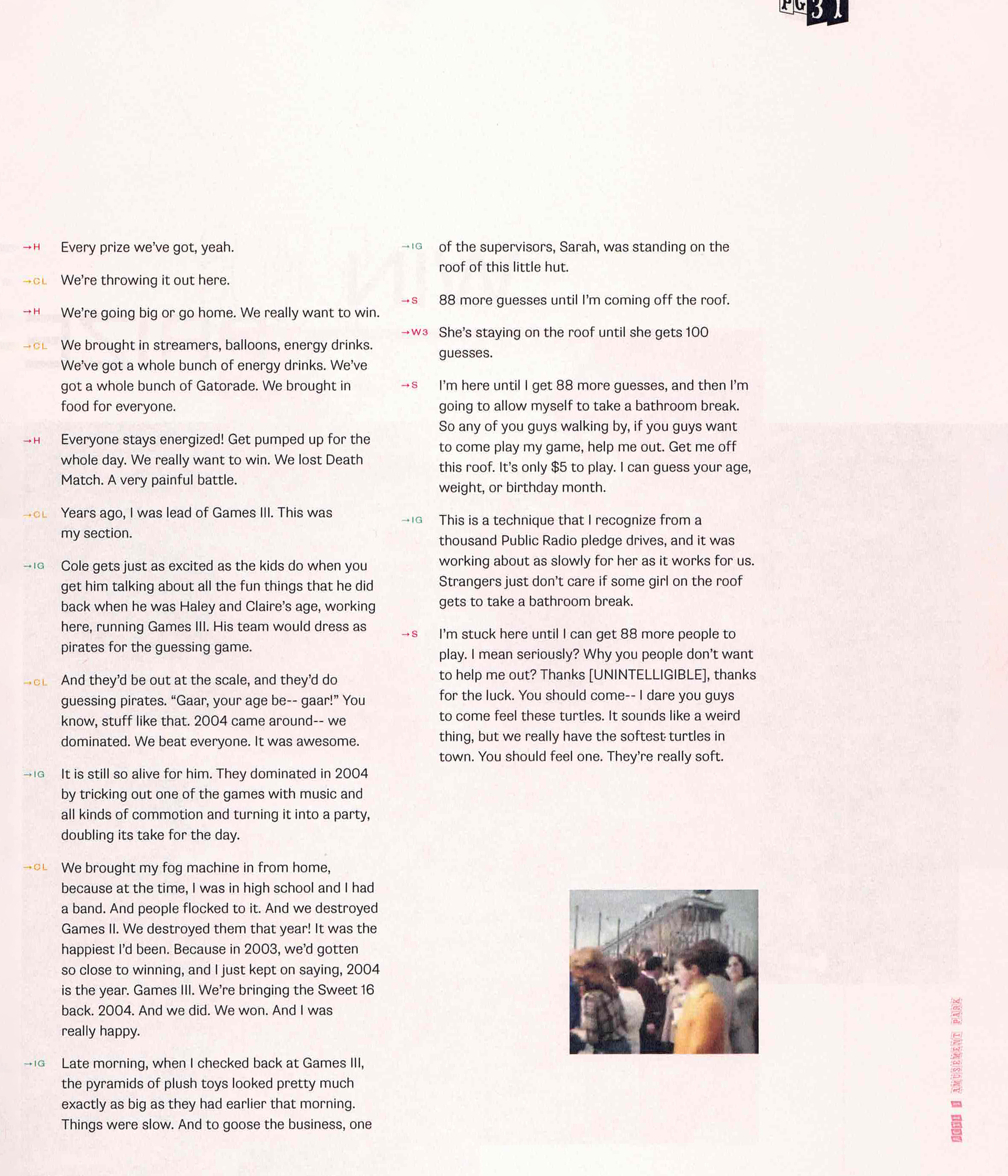
The episode is told in three acts, each from a reflective point of view. This influenced the imagery in the publication to be taken from archival home videos to capture the essence of nostalgia. In addition, the podcast included a number of audio effects, an integral park of an actual amusement park experience– The motion perceived in the found footage most closely translated the expressive audio that was to be lost in print.
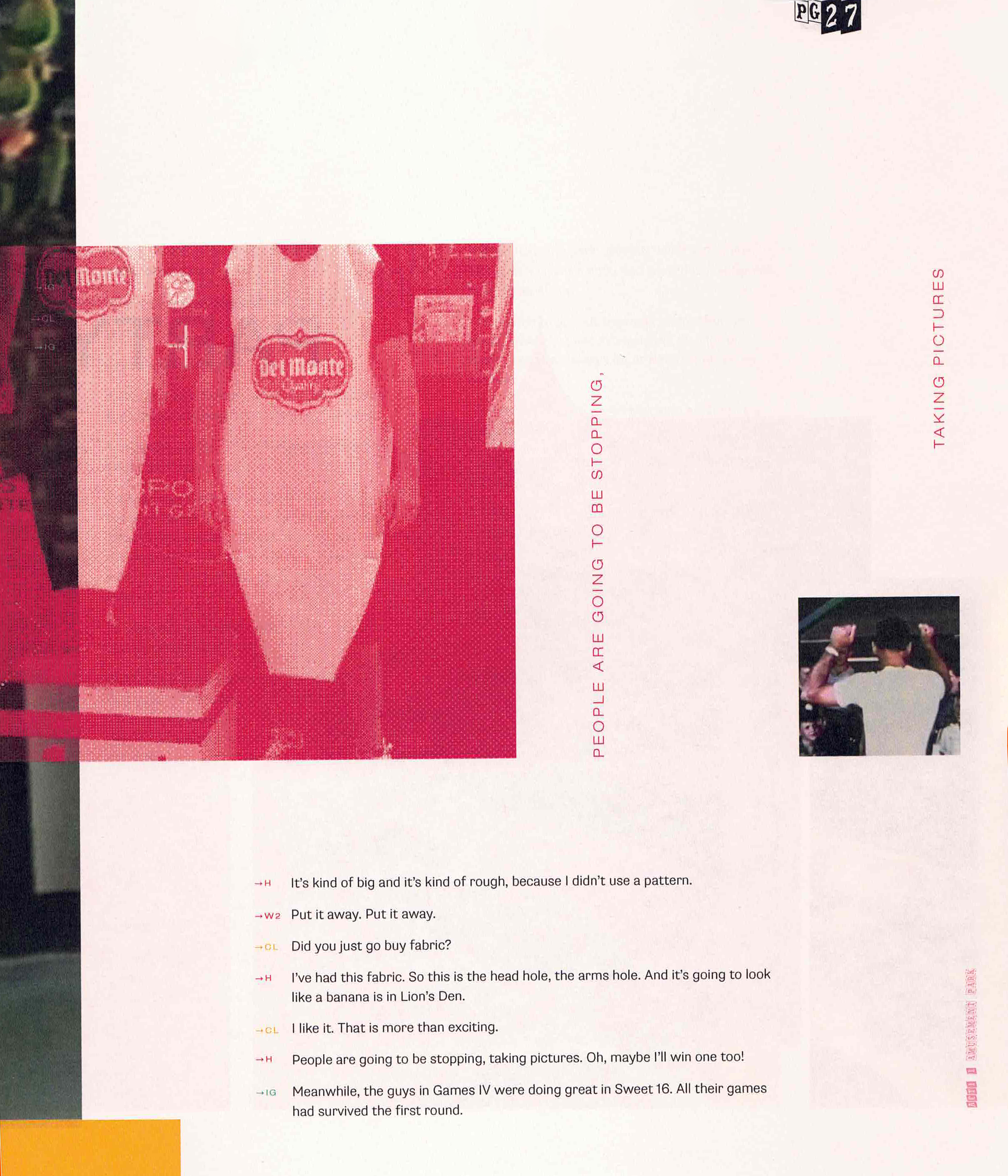
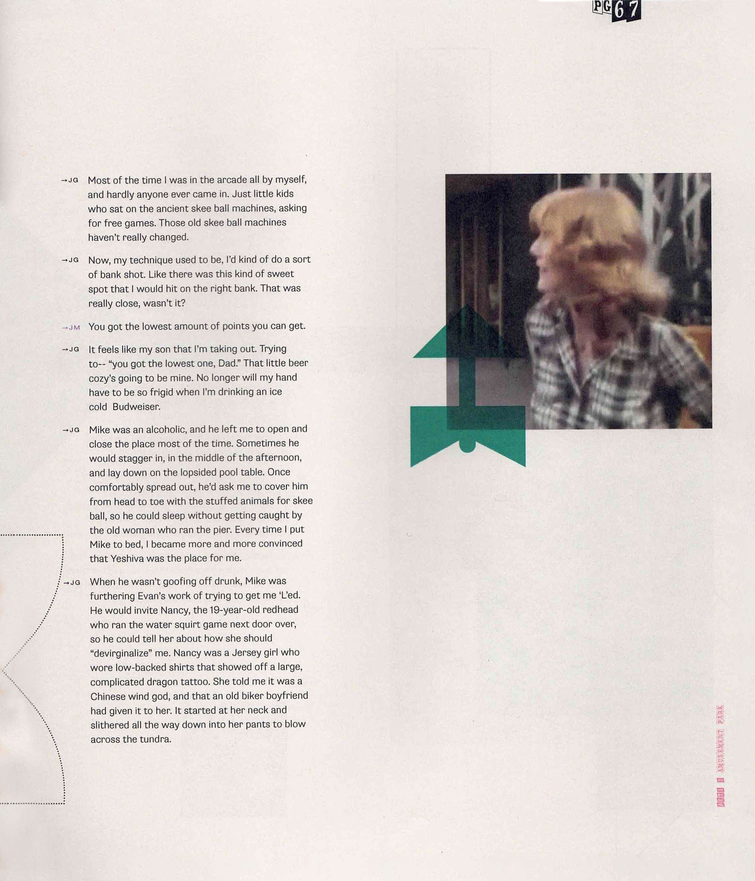
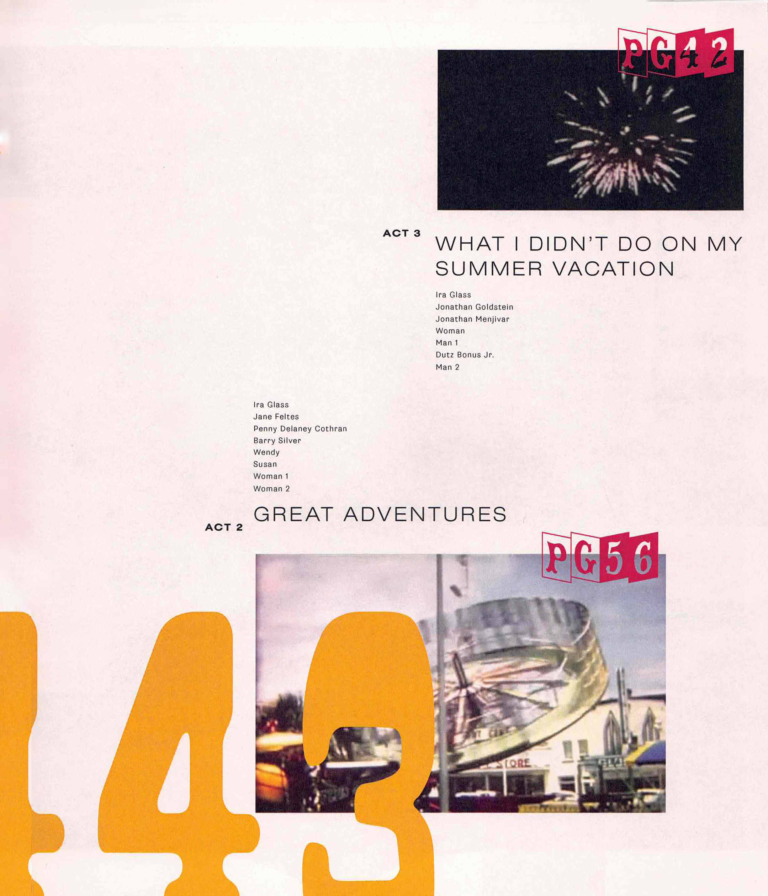
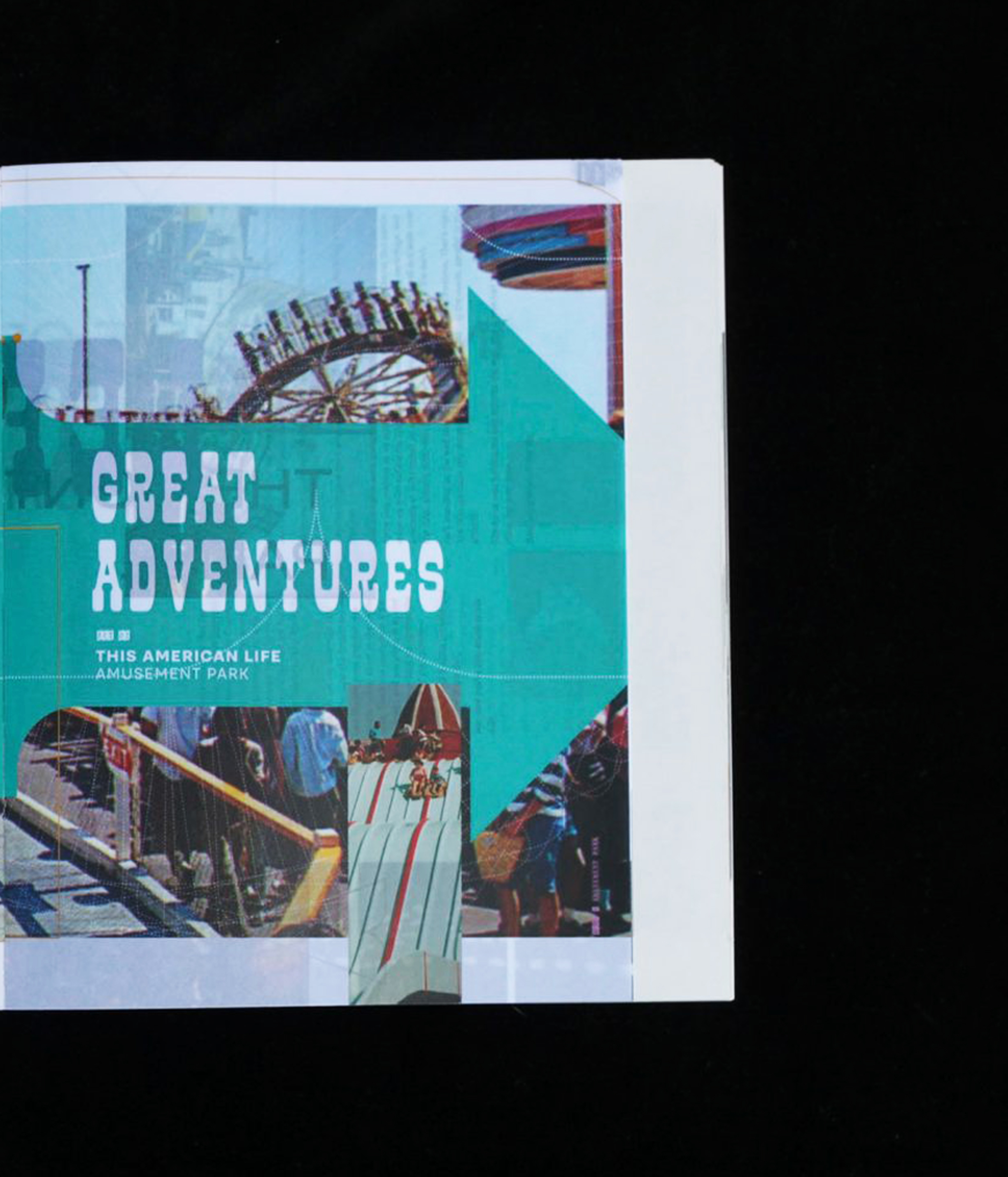
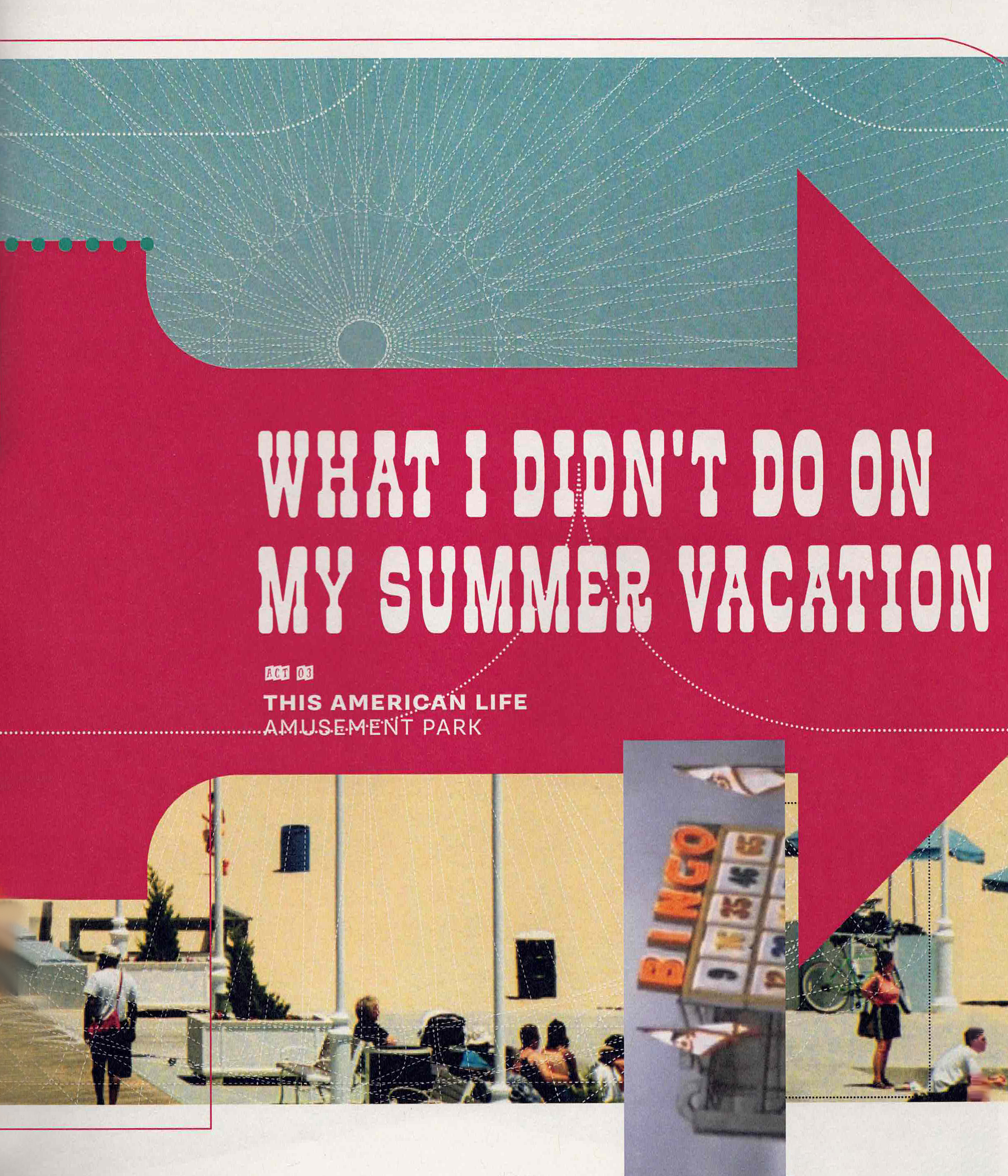
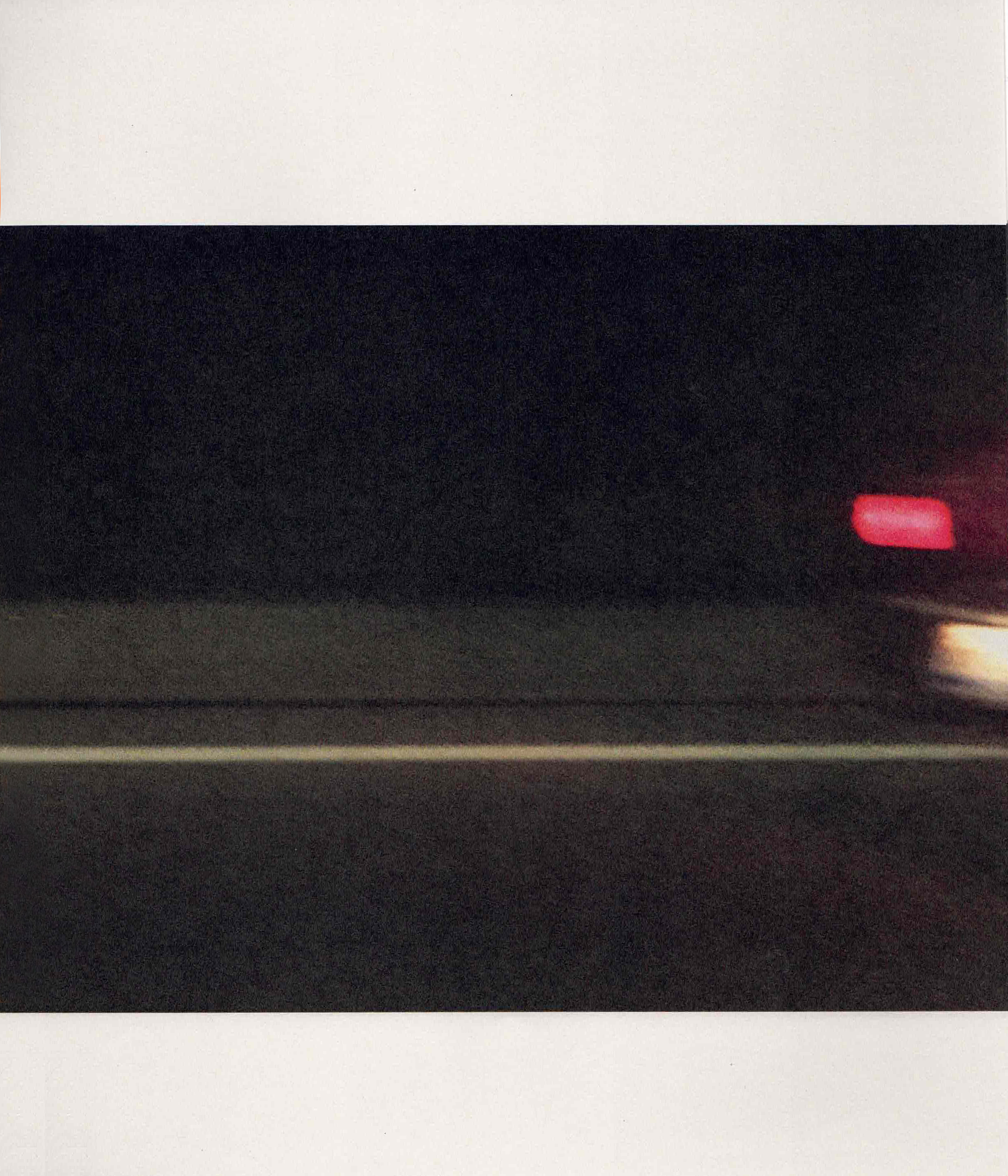
Secondary imagery are video stills that have been bitmapped to visualize recollection, moments not entirely put together. In the first act these are pink to reflect the positive memory, while the third is black to parallel the mood change. Similarly, each act is printed on a different stock of paper; pink, translucent vellum, and grey.
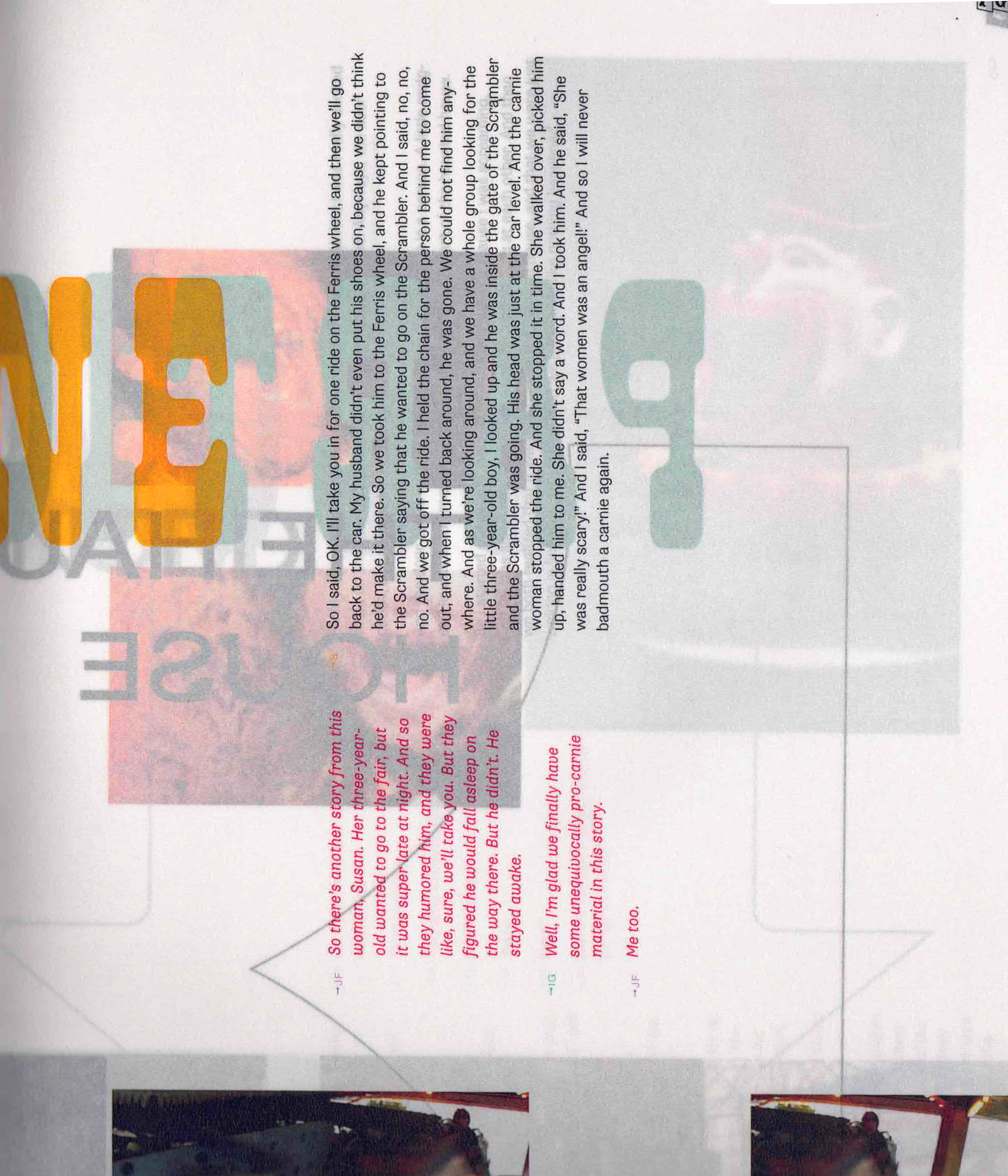
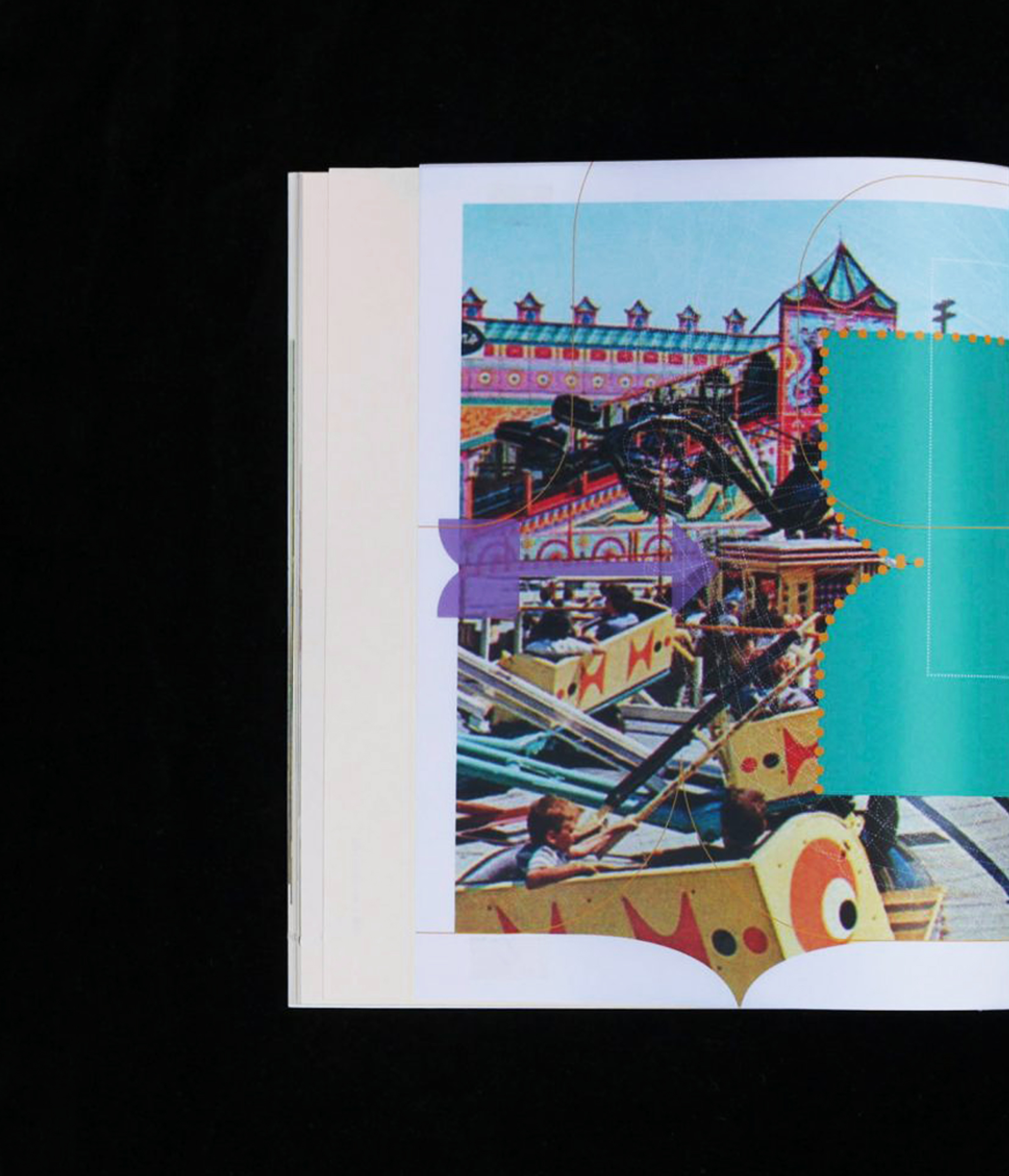
The second act changes format to call-in experiences, because of their rapid recital, the page is physically smaller, the grid structure changes to accommodate the stories length in a single spread to consume the story all at once, and transparent paper stock is used to illustrate how a listener may muddle these stories together.
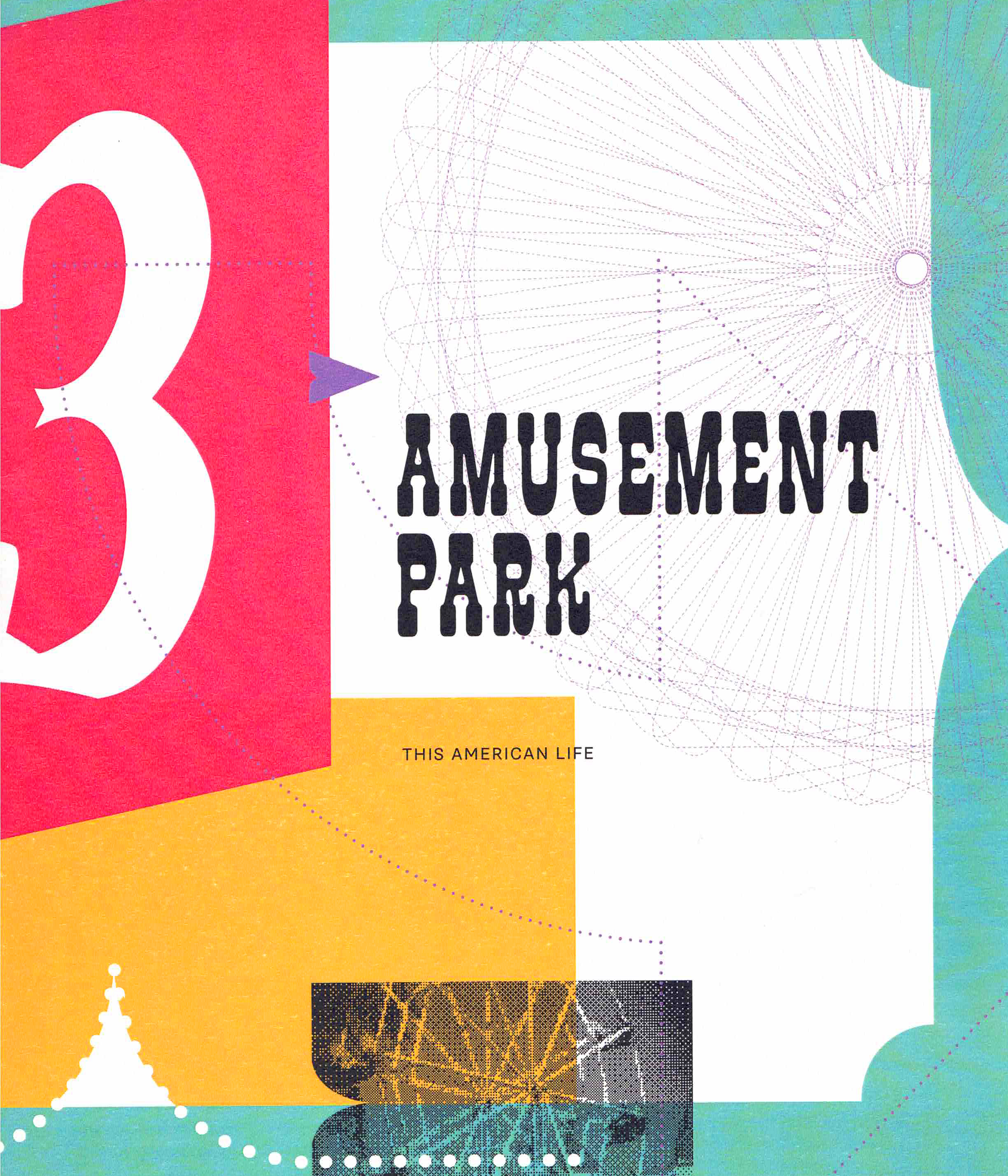
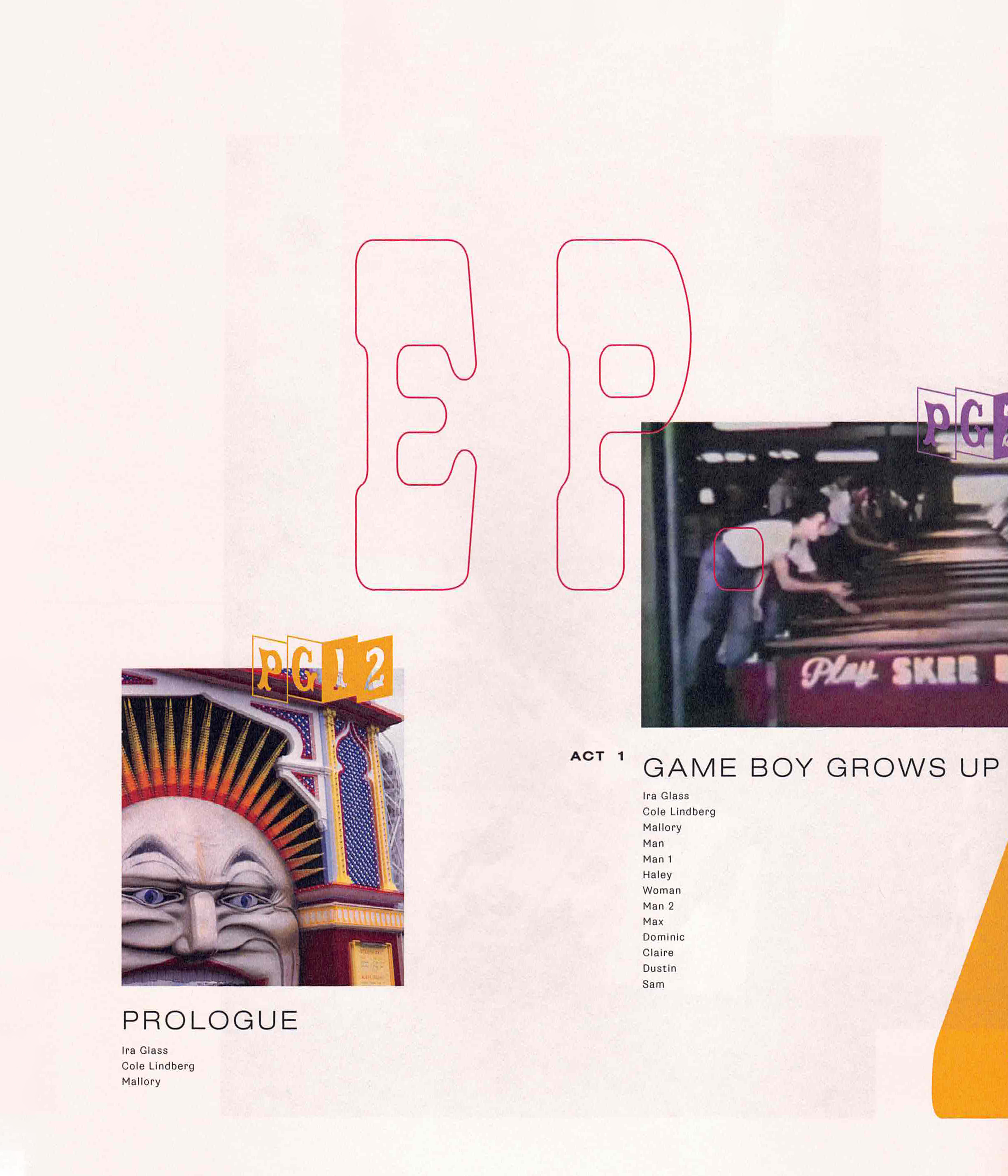
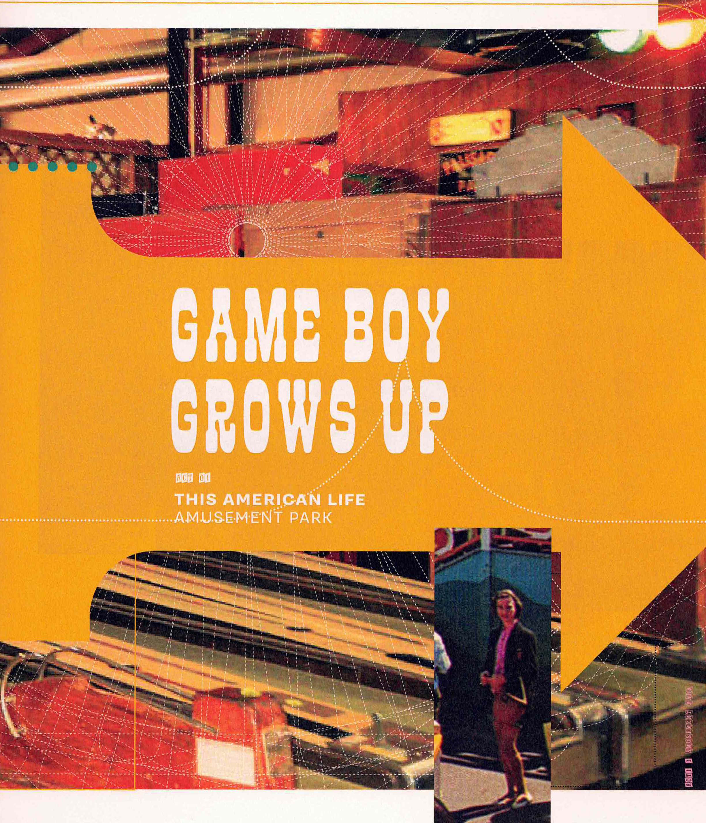
Overall the design features rhetorical elements like arrows and decorative edges to echo the vernacular used in classic American amusement parks.
